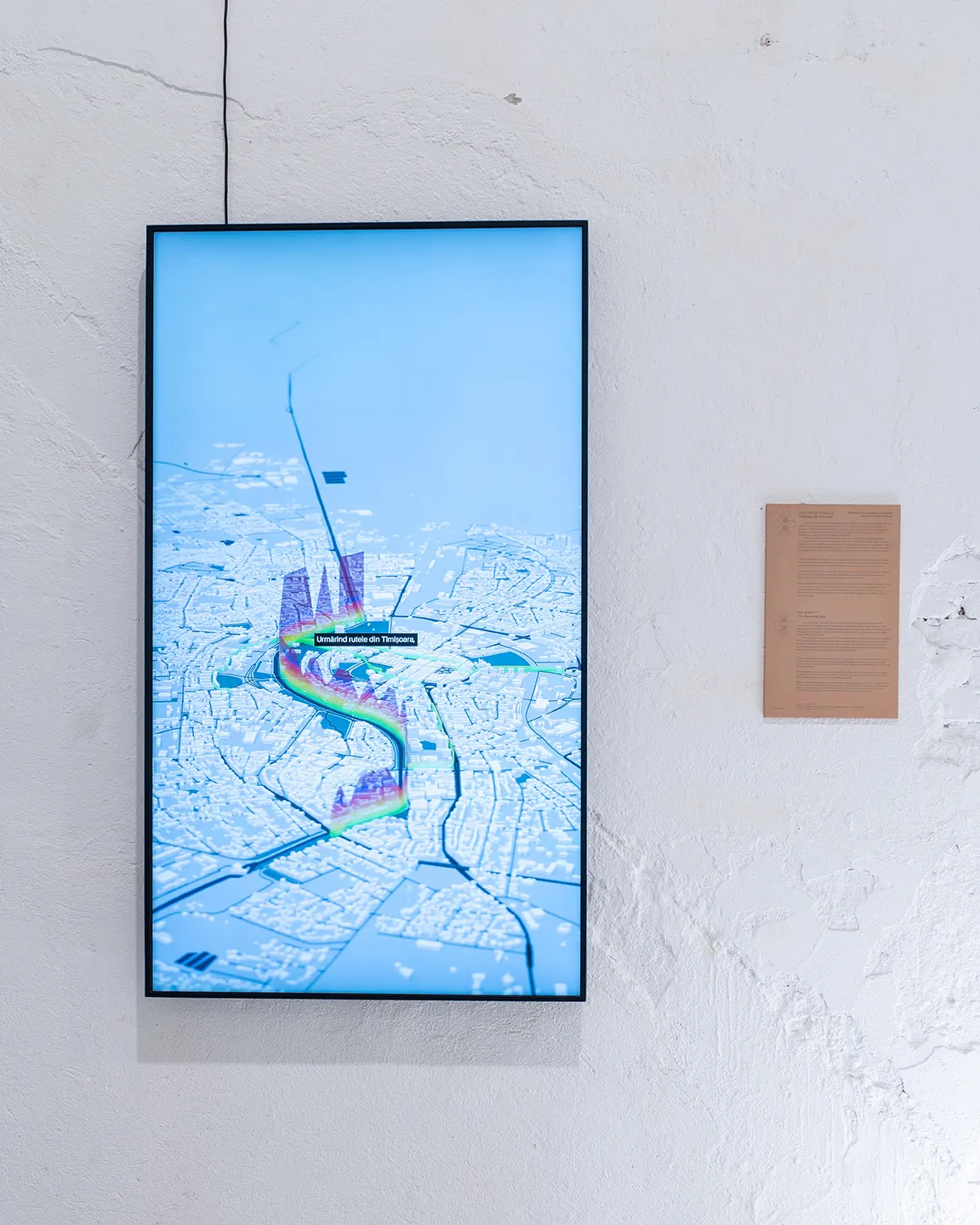
As part of this year’s iteration of the ongoing Young Matters multidisciplinary project, Air Quality, The Sensing Unit transforms abstract air quality data into a tangible public experience, allowing us to see air pollutants and better understand how they impact on the quality of our air and lives.
Bridging the fields of environmental engineering, data science, and critical design, research engineers Marian-Emanuel Ionașcu and Sebastian Petruc worked with R_73 designers Fabio Salvadori and Federico Santarini to visualise data on air quality. Through animated visualizations, on-site installations and urban billboards, the project moves beyond standardised charts to reveal the emotional, spatial, and bodily impact of the air we breathe.
For the first iteration of this public experiment, devices were installed in three key locations in Timișoara identified by the creators: The FABER headquarters, Timișoara City Hall, and the Polytechnic University campus..
Here, the project’s creators explore the technical hurdles, design strategies, and public potential of this speculative work, which aims not just to inform, but to engage and empower its viewers by visualising the many pollutants present in the air we breathe.
Chemical Bonds: How would you describe the exhibition to someone who has not yet experienced it?
Marian-Emanuel Ionașcu: Our project is designed to visualise air pollution in your area, at any moment of the day. The core idea is to make pollution visible, help people understand the associated risks, and empower them to take informed actions based on that data.
CB: And designers, Fabio and Federico, what was your starting point for creating a visual language that could bring air quality data to life?
Fabio Salvadori: For us, the starting point was noticing that this type of data is always locked away on a city’s web portal and is never really experienced by the broader public.
Federico Santorini: As information designers, that was the gap that interested us—making this data available and tangible within the urban environment itself.
CB: The project description talks about air quality data as having an emotional, spatial, and experiential element. Marian, why is it important to move beyond traditional, standardized data presentations?
MI: Across Europe, we monitor air pollution using fixed stations. While they provide accurate data, they lack spatial and temporal resolution. One station cannot represent the air quality from one street to the next, and they are often placed far from where people actually gather, like parks or malls. So, the data isn't truly relevant to our daily lives. Emotionally, this data is often just numbers and colours—usually just green or red—that aren't easily understandable. Not many people can distinguish the health implications between yellow, orange, or red, and this isn't well presented to a broader audience.
CB: Fabio and Federico, how did you then go about representing this data in a way that would answer the concerns Marian highlighted and show these emotional and spatial sides?
Fabio S: We decided on a more verbal approach than a purely numeric one. Instead of just representing a number with a graphic, we gave written messages about the effects of that specific pollution level on people with particular health conditions. This allows the data to be received at a much more actionable level for the public.
Federico S: Beyond the text, we created several different kinds of visualizations—2D representations, 3D environments, colour, and text—represented in the environment of the city.
We used geolocated data to create a 3D environment showing the city and its air quality at each point. The emotional part, in my interpretation, comes from the fact that the project allows individuals to understand the air quality around their body. With Marian's technology, it becomes a human-centric approach, not a sensor-centric one. It becomes about you, not just the city.
CB: What were the biggest technical challenges in developing a real-time air quality monitoring system for public spaces?
MI: The biggest challenge, for us and the entire research community, is the accuracy of the sensors. To create affordable, widespread devices, we must use low-cost sensors, which are known for lower accuracy and selectivity. The calibration—making these sensors show reference-grade measurements that correlate with the real phenomena—was our biggest hurdle. We tackled this through collaborations, like with the Norwegian Institute for Air Research, and by employing machine learning algorithms to correct the data.
CB: And from a technical standpoint, does your "speculative approach" mean developing prototypes for future tech, or using current technology in new ways?
MI: Both. We started by integrating all the current state-of-the-art technology. But we hit points where we needed to develop our own circuit boards to pinpoint specific errors. So now, we are more in the research phase, trying to find gaps in current implementations to step further in the development of these devices and increase user confidence.
CB: This sounds like something that could become very real. With patents pending, do you see this as a widely available product or something that stays in the realm of theory and exhibition?
MI: My initial goal was always to pinpoint pollution around an individual and to develop devices that can be sold commercially. We hit a wall with user confidence, which led us into deeper research. The pending patent is for a broader solution that incorporates fixed, mobile, and wearable devices. We are actively working towards this goal, with initiatives to install our devices long-term and even place them on city buses. So yes, our idea is for individuals or businesses to be able to see the pollution anywhere we go in the city with high enough confidence.
CB: The work unfolds across animated visualizations, on-site installations, and a video on a billboard. How did you develop a visual language that works across all these mediums?
Federico S: Our starting point was the Air Quality Index (AQI), an internationally recognized standard with specific rules about substances and corresponding colours. We used that as a foundation to keep everything consistent, so there’s a common index you can use to read all the visualisations.
Fabio S: From a conceptual point of view, what tied everything together was visualizing the pollutant particles themselves—this "zoom-in" approach. We weren't just visualising the air as a mass, but the various pollutants that contribute to its measurement. This created a visual connection between the different pieces, even though they were situated in very different spaces.
Federico S: We wanted to make pollution tangible. If we knew there were, say, 500 particles of nitrogen dioxide in the air, we represented 500 particles. We wanted to materialise and bring to life what appears as just a single number.
CB: Federico, with your background in data geography and cartography, how did you map something as intangible as atmospheric pollution?
Federico S: We took advantage of Marian's wearable devices. We thought it was interesting to use them to map the city and give a specific image of it at a specific time. We had students collaborate with us to do live monitoring by walking, which connected directly to the visualisation and the possibility to analyse the city through it.
CB: The animated visualisation aims to show pollutants in a single breath. As designers, how did you create a visual metaphor for something so intimate and connected to the body?
Fabio S: We made calculations to connect the Air Quality Index to what you breathe in a single breath. By making these connections in the city within a 3D space, we created a very located visualisation. Our animation also incorporates the variable of time, allowing us to use techniques akin to a short documentary to maximise the viewer's experience.
CB: Marian, this collaboration seems unique, bridging environmental tech with visualization design. To what extent did working with Fabio and Federico influence your current and future products?
MI: I saw the collaboration as a unique opportunity. In recent years, we've been trying to correlate air pollution with cognitive functions or health, working with psychologists and medics. A constant issue is that the public doesn't understand the data. Our current app wasn't designed to be understandable by the average person. This project is a chance to change that. The engagement from students was huge, and they prefer this visual approach. I hope we can continue working together to move our applications a step further.
CB: Fabio and Federico, what was your perspective on the collaboration? Did you learn anything surprising about air quality data?
Fabio S: For us, it's always really nice to work with real data and innovative research. That doesn't always happen in the artistic and design world.
Federico S: And also to work with the people who created it. Often, you just receive a pack of data and that's it. Here, we had interaction with the people and procedures behind it, which was invaluable.
CB: Finally, Marian, how do you feel the public could benefit from your plans for releasing air monitors commercially?
MI: Air pollution is an invisible threat, and we often discover health issues related to it too late. I would like to see more wearable initiatives in the future. I am looking forward to continuing this project and trying to standardise devices, with the goal of creating a wearable device, perhaps for your wrist, to ensure people have these mappings and can make informed decisions on the air quality in their area.